Elastic tabstops - a better way to indent and align code
Programming fonts: proportional vs monospaced
Update on 2012-03-10: Someone wrote a link to some interesting proportional programming fonts in the comments section. Here's the link.
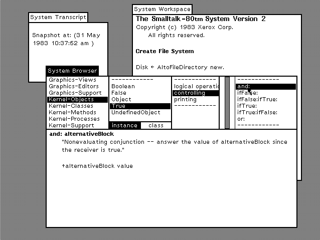
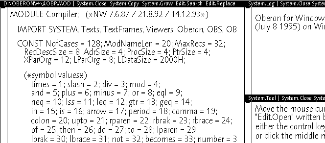
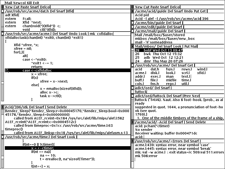
One of the main reasons why I originally invented elastic tabstops was because I'm a big fan of using proportional fonts for programming. As programmers we spend most of our time looking at code and in my opinion proportional fonts make this an easier and more pleasant experience. The creators of Smalltalk, Oberon and Plan 9's Acme seem to agree.
I've made some screenshots of Gedit using my elastic tabstops plugin (minimum-width: 32, padding-width: 8) and the zenburn theme with some different fonts I have installed on this Ubuntu system.
-
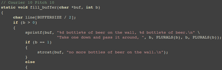
Courier 10 Pitch is one of IBM's serifed typewriter faces by Howard Kettler in Lexington in 1956. It's comparable to Courier New, but since I'll be covering a lot of Microsoft's core web fonts in this article I thought I'd use this font rather than the later derivative.
-
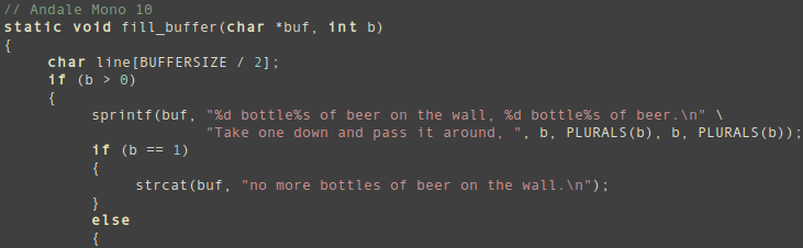
Andale Mono's a typical programmer's monospaced font. Let's see how it compares with the proportional fonts in the list.
-
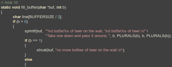
Ah, Arial. I'd rather have taken a screenshot of Helvetica but I don't have it. This is my least favourite of the sans-serif proportional fonts listed in this article, but I think it's still an improvement on the 2 monospaced fonts above.
-
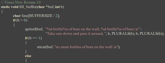
And here's good old Times New Roman. I think the italic version of this font was used for the code excerpts in Stroustrup's "The C++ Programming Language" book. Of the fonts listed here, this one's the thinnest. Those squiggly brackets look a bit strange to me though.
-
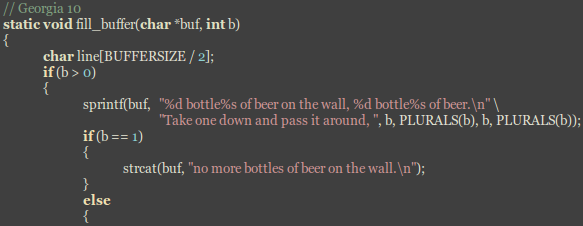
Georgia is my favourite of the proportional serif fonts listed here, and it's by Matthew Carter, who Microsoft commissioned to design 2 fonts (the other being the sans-serif Verdana) specifically for screen readability.
-
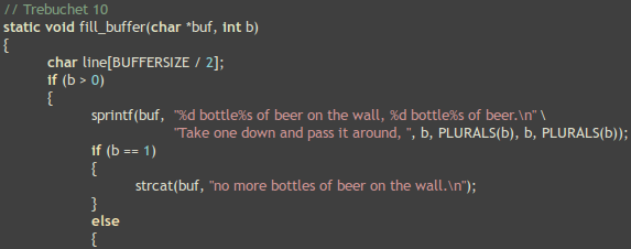
Trebuchet's not bad, but there's better further down.
-
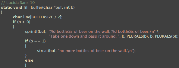
Lucida Sans is pretty good and worth a look, especially if you can't or won't use Microsoft's fonts for whatever reason.
-
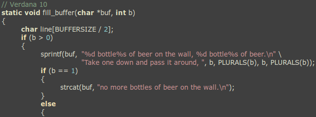
And now my favourite, Verdana, also by Matthew Carter. It's exceptionally readable, possibly due to it's wide characters (but still much thinner than the 2 monospaced fonts at the top of the list). It was also designed to have pretty loose letter-spacing and emphasised distinctions between similarly-shaped characters to increase legibility (important in a programming font). You can read more about why this font (and Georgia) is so great for the screen here. This is what I use every day.
-
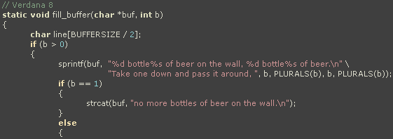
I put this on the end for fun. It's Verdana at size 8 without anti-aliasing and it's what I used to use when resolutions were lower and before anti-aliased fonts were widely used. It's still pretty readable though.
So that's the list. I hope you'll agree that proportional fonts are much easier to read than monospaced ones. You can use them for coding now (as long as no one tries to align text for anything other than indentation), and if elastic tabstops catch on you'll be able to use them for aligning text as well as indenting. I'm working on a plugin for Eclipse now (since a blocking missing feature has now been implemented), so depending on which tools you use that day may be coming soon.
Posted on Tuesday, 2009-12-22 at 23:52 UTC
13 comments
Comments are closed.